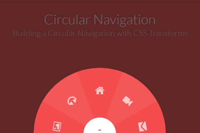

In this post I am going to show to how to create a circular Navigation using css3 transform effect. By following some simple logic and steps you can create a very good looking circular Navigation.
Like I am going to mention here something for example we are using some basic math calculation to create css transform to create these styles.
HTML:-
<div class="component">
				<!-- Start Nav Structure -->
				<button class="cn-button" id="cn-button">+</button>
				<div class="cn-wrapper" id="cn-wrapper">
				    <ul>
				      <li><a href="#"><span class="icon-picture"></span></a></li>
				      <li><a href="#"><span class="icon-headphones"></span></a></li>
				      <li><a href="#"><span class="icon-home"></span></a></li>
				      <li><a href="#"><span class="icon-facetime-video"></span></a></li>
				      <li><a href="#"><span class="icon-envelope-alt"></span></a></li>
				     </ul>
				</div>
				<div id="cn-overlay" class="cn-overlay"></div>
				<!-- End Nav Structure -->
			</div>
CSS:-
.csstransforms .cn-wrapper {
  font-size: 1em;
  width: 26em;
  height: 26em;
  overflow: hidden;
  position: fixed;
  z-index: 10;
  bottom: -13em;
  left: 50%;
  border-radius: 50%;
  margin-left: -13em;
  -webkit-transform: scale(0.1);
  -ms-transform: scale(0.1);
  -moz-transform: scale(0.1);
  transform: scale(0.1);
  pointer-events: none;
  -webkit-transition: all .3s ease;
  -moz-transition: all .3s ease;
  transition: all .3s ease;
}

.csstransforms .opened-nav {
  border-radius: 50%;
  pointer-events: auto;
  -webkit-transform: scale(1);
  -moz-transform: scale(1);
  -ms-transform: scale(1);
  transform: scale(1);
}

.cn-overlay {
  width: 100%;
  height: 100%;
  background-color: rgba(0,0,0,0.6);
  position: fixed;
  top: 0;
  left: 0;
  bottom: 0;
  right: 0;
  opacity: 0;
  visibility: hidden;
  -webkit-transition: all .3s ease;
  -moz-transition: all .3s ease;
  transition: all .3s ease;
  z-index: 2;
}

.cn-overlay.on-overlay {
  visibility: visible;
  opacity: 1;
}

.cn-button {
  border: none;
  background: none;
  color: #f06060;
  text-align: center;
  font-size: 1.8em;
  padding-bottom: 1em;
  height: 3.5em;
  width: 3.5em;
  background-color: #fff;
  position: fixed;
  left: 50%;
  margin-left: -1.75em;
  bottom: -1.75em;
  border-radius: 50%;
  cursor: pointer;
  z-index: 11;
}

.cn-button:hover,
.cn-button:active,
.cn-button:focus {
  color: #aa1010;
}

.csstransforms .cn-wrapper li {
  position: absolute;
  font-size: 1.5em;
  width: 10em;
  height: 10em;
  -webkit-transform-origin: 100% 100%;
  -moz-transform-origin: 100% 100%;
  -ms-transform-origin: 100% 100%;
  transform-origin: 100% 100%;
  overflow: hidden;
  left: 50%;
  top: 50%;
  margin-top: -1.3em;
  margin-left: -10em;
  -webkit-transition: border .3s ease;
  -moz-transition: border .3s ease;
  transition: border .3s ease;
}

.csstransforms .cn-wrapper li a {
  display: block;
  font-size: 1.18em;
  height: 14.5em;
  width: 14.5em;
  position: absolute;
  bottom: -7.25em;
  right: -7.25em;
  border-radius: 50%;
  text-decoration: none;
  color: #fff;
  padding-top: 1.8em;
  text-align: center;
  -webkit-transform: skew(-50deg) rotate(-70deg) scale(1);
  -ms-transform: skew(-50deg) rotate(-70deg) scale(1);
  -moz-transform: skew(-50deg) rotate(-70deg) scale(1);
  transform: skew(-50deg) rotate(-70deg) scale(1);
  -webkit-backface-visibility: hidden;
  -webkit-transition: opacity 0.3s, color 0.3s;
  -moz-transition: opacity 0.3s, color 0.3s;
  transition: opacity 0.3s, color 0.3s;
}

.csstransforms .cn-wrapper li a span {
  font-size: 1.1em;
  opacity: 0.7;
  transform:rotate(0deg);

}
.csstransforms .cn-wrapper li:hover a span {
  font-size: 1.1em;
  opacity: 0.7;
  transform:rotate(180deg);
  transition: ease 0.3s;

}


/* for a central angle x, the list items must be skewed by 90-x degrees
in our case x=40deg so skew angle is 50deg
items should be rotated by x, minus (sum of angles - 180)2s (for this demo) */

.csstransforms .cn-wrapper li:first-child {
  -webkit-transform: rotate(-10deg) skew(50deg);
  -ms-transform: rotate(-10deg) skew(50deg);
  -moz-transform: rotate(-10deg) skew(50deg);
  transform: rotate(-10deg) skew(50deg);
}

.csstransforms .cn-wrapper li:nth-child(2) {
  -webkit-transform: rotate(30deg) skew(50deg);
  -ms-transform: rotate(30deg) skew(50deg);
  -moz-transform: rotate(30deg) skew(50deg);
  transform: rotate(30deg) skew(50deg);
}

.csstransforms .cn-wrapper li:nth-child(3) {
  -webkit-transform: rotate(70deg) skew(50deg);
  -ms-transform: rotate(70deg) skew(50deg);
  -moz-transform: rotate(70deg) skew(50deg);
  transform: rotate(70deg) skew(50deg)
}

.csstransforms .cn-wrapper li:nth-child(4) {
  -webkit-transform: rotate(110deg) skew(50deg);
  -ms-transform: rotate(110deg) skew(50deg);
  -moz-transform: rotate(110deg) skew(50deg);
  transform: rotate(110deg) skew(50deg);
}

.csstransforms .cn-wrapper li:nth-child(5) {
  -webkit-transform: rotate(150deg) skew(50deg);
  -ms-transform: rotate(150deg) skew(50deg);
  -moz-transform: rotate(150deg) skew(50deg);
  transform: rotate(150deg) skew(50deg);
}

.csstransforms .cn-wrapper li:nth-child(odd) a {
  background-color: #a11313;
  background-color: hsla(0, 88%, 63%, 1);
}

.csstransforms .cn-wrapper li:nth-child(even) a {
  background-color: #a61414;
  background-color: hsla(0, 88%, 65%, 1);
}

/* active style */
.csstransforms .cn-wrapper li.active a {
  background-color: #b31515;
  background-color: hsla(0, 88%, 70%, 1);
}


/* hover style */
.csstransforms .cn-wrapper li:not(.active) a:hover,
.csstransforms .cn-wrapper li:not(.active) a:active,
.csstransforms .cn-wrapper li:not(.active) a:focus {
  background-color: #b31515;
  background-color: hsla(0, 88%, 70%, 1);
}
.csstransforms .cn-wrapper li:not(.active) a:focus
{
    position:fixed;
}


/* fallback */
.no-csstransforms .cn-button {
  display: none;
}

.no-csstransforms .cn-wrapper li {
  position: static;
  float: left;
  font-size: 1em;
  height: 5em;
  width: 5em;
  background-color: #eee;
  text-align: center;
  line-height: 5em;
}

.no-csstransforms .cn-wrapper li a {
  display: block;
  width: 100%;
  height: 100%;
  text-decoration: none;
  color: inherit;
  font-size: 1.3em;
  border-right: 1px solid #ddd;
}

.no-csstransforms .cn-wrapper li a:last-child {
  border: none;
}

.no-csstransforms .cn-wrapper li a:hover,
.no-csstransforms .cn-wrapper li a:active,
.no-csstransforms .cn-wrapper li a:focus {
  background-color: white;
}

.no-csstransforms .cn-wrapper li.active a {
  background-color: #6F325C;
  color: #fff;
}

.no-csstransforms .cn-wrapper {
  font-size: 1em;
  height: 5em;
  width: 25.15em;
  bottom: 0;
  margin-left: -12.5em;
  overflow: hidden;
  position: fixed;
  z-index: 10;
  left: 50%;
  border: 1px solid #ddd;
}

@media screen and (max-width:480px) {
  .csstransforms .cn-wrapper {
    font-size: .68em;
  }

  .cn-button {
    font-size: 1em;
  }

  .csstransforms .cn-wrapper li {
    font-size: 1.52em;
  }
}

@media screen and (max-width:320px) {
  .no-csstransforms .cn-wrapper {
    width: 15.15px;
    margin-left: -7.5em;
  }

  .no-csstransforms .cn-wrapper li {
    height: 3em;
    width: 3em;
  }
}
Jquery:-
(function(){

	var button = document.getElementById('cn-button'),
    wrapper = document.getElementById('cn-wrapper'),
    overlay = document.getElementById('cn-overlay');

	//open and close menu when the button is clicked
	var open = false;
	button.addEventListener('click', handler, false);
	wrapper.addEventListener('click', cnhandle, false);

	function cnhandle(e){
		e.stopPropagation();
	}

	function handler(e){
		if (!e) var e = window.event;
	 	e.stopPropagation();//so that it doesn't trigger click event on document

	  	if(!open){
	    	openNav();
	  	}
	 	else{
	    	closeNav();
	  	}
	}
	function openNav(){
		open = true;
	    button.innerHTML = "-";
	    classie.add(overlay, 'on-overlay');
	    classie.add(wrapper, 'opened-nav');
	}
	function closeNav(){
		open = false;
		button.innerHTML = "+";
		classie.remove(overlay, 'on-overlay');
		classie.remove(wrapper, 'opened-nav');
	}
	document.addEventListener('click', closeNav);

})();