
Responsive jQuery Thumbnail Image Carousel | Thumbnail Image Slider | Responsive Thumbnail Image Slider
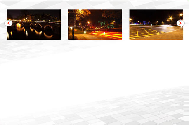
Today we want to show you how to create a responsive image slider with a thumbnail carousel using jquery. we want to implement a responsive slider that adapts to the view-port width. The slider will have a view switch that allows to view it with the thumbnail carousel or without. We’ll also add the possibility to navigate with the keyboard.
We’ll use the flixslider.js that will make it possible to navigate the images by “clicking” on the iPhone, desktop, mobile and iPad.
So, let’s do it!
For the HTML structure we’ll have a main wrapper with the id “flexiselDemo3 and li will contains image and its structure css.
Html
 <ul id="flexiselDemo3">
        <li><img src="images/1.jpg" /></li>
        <li><img src="images/2.jpg" /></li>
        <li><img src="images/3.jpg" /></li>
        <li><img src="images/4.jpg" /></li>
      </ul>
CSS
#flexiselDemo1, #flexiselDemo2, #flexiselDemo3 {
display:none;
}

.nbs-flexisel-container {
    position:relative;
    max-width:100%;
}
.nbs-flexisel-ul {
    position:relative;
    width:99999px;
    margin:0px;
    padding:0px;
    list-style-type:none;
    text-align:center;
}

.nbs-flexisel-inner {
    position: relative;
    overflow: hidden;
    float:left;
    width:100%;

}

.nbs-flexisel-item {
    float:left;
    margin:0px;
    padding:0px;
    cursor:pointer;
    position:relative;
    line-height:0px;
	background:none;
	border-radius:8px;
	box-shadow:none;
	transition:all 0.5s ease;
}
.nbs-flexisel-item img:hover {background:#fff;box-shadow:0px 0px 3px #ccc;}
.nbs-flexisel-item img {
    max-width: 100%;
    cursor: pointer;
	padding:20px;
    position: relative;
    margin-top: 10px;
    margin-bottom: 10px;
}

/*** Navigation ***/

.nbs-flexisel-nav-left,
.nbs-flexisel-nav-right {
    padding:2px 10px 0px 10px;
    border-radius:6px;
    -moz-border-radius:15px;
    -webkit-border-radius:15px;
    position: absolute;
    cursor: pointer;
    z-index: 4;
    top:40%;
    background:#fff;
    color: #fd3519;
	border:1px solid #adacac;
}

.nbs-flexisel-nav-left {
    left: 10px;
}

.nbs-flexisel-nav-left:before {
    content:  "\f053";
	font-family: FontAwesome;
    font-style: normal;
    font-weight: normal;
    text-decoration: inherit;
}

.nbs-flexisel-nav-left.disabled {
    opacity: 0.4;
}

.nbs-flexisel-nav-right {
    right: 5px;
}

.nbs-flexisel-nav-right:before {
    content:  "\f054";
	font-family: FontAwesome;
    font-style: normal;
    font-weight: normal;
    text-decoration: inherit;
}

.nbs-flexisel-nav-right.disabled {
    opacity: 0.4;
}
JAVASCRIPT
<script type="text/javascript" src="http://code.jquery.com/jquery-1.7.1.min.js"></script>
<script type="text/javascript" src="js/jquery.flexisel.js"></script>
<script type="text/javascript">

$(window).load(function() {

    $("#flexiselDemo3").flexisel({
        visibleItems: 4,
        itemsToScroll: 1,
        autoPlay: {
            enable: true,
            interval: 5000,
            pauseOnHover: true
        }
    });


});
</script>