
Hi All today I am going to share with you a Build Responsive Grid Layout Using Bootstrap. Where as I have previously shared a Equal Height Columns with javascript and Awesome Input Focus Effects, they where very unique and usefull to use with any website, which can enhance the beauty of any webapplication or website.
As my recent post Awesome input focus effects gain losts of popularity and appreciation from you, sure about this one too you will appreciate and like it.
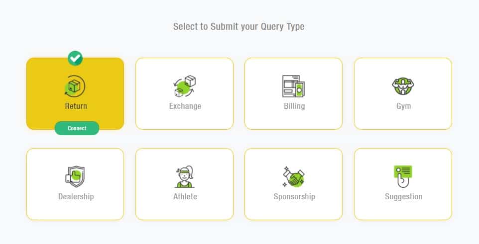
Lets the dicuss where you can use these Build Responsive Grid Layout Using Bootstrap with your website. Like if you in need a grid having icon and title and a button to navigate it furthure pages or section and you want to notate clicked grid or section on click, it will be helpfull in this scenario.
Also if you want to a clickable tab or grid using bootstrap it can be used in place where I have given two animated icons on a div on top and bottom check and click to action button respectively.
How to Build Responsive Grid Layout Using Bootstrap:
Html Code:
1 2 3 4 5 6 7 8 9 10 11 12 13 14 15 16 17 18 19 20 21 22 23 24 25 26 27 28 29 30 31 32 33 34 35 36 37 38 39 40 41 42 43 44 45 46 47 48 49 50 51 52 53 54 55 56 57 58 59 60 61 62 63 64 65 66 67 68 69 70 71 | <div class="container"> <div class="row"> <div class="col-md-12 cta-title">Select to Submit your Query Type</div> </div> <div class="row"> <div class="col-md-3 col-sm-6"><div class="mail-tab"><div class="fuller"><a class="full-anchor" href="#" target="_blank"> </a></div> <div class="check-icon"><img src="http://advancenutratech.com/images/icons-cta/checked.svg"></div> <div class="ctgy-icon"><img src="http://advancenutratech.com/images/icons-cta/advancenutratech/Return.png"></div> <i class="fa fa-file-excel-o text-muted"></i> <h3>Return</h3> <div class="cta-btn"><a href="#" target="_blank">Connect</a></div> </div></div> <div class="col-md-3 col-sm-6"><div class="mail-tab"><div class="fuller"><a class="full-anchor" href="#" target="_blank" > </a></div> <div class="check-icon"><img src="http://advancenutratech.com/images/icons-cta/checked.svg"></div> <div class="ctgy-icon"><img src="http://advancenutratech.com/images/icons-cta/advancenutratech/Exchange.png"></div> <i class="fa fa-file-excel-o text-muted"></i> <h3>Exchange</h3> <div class="cta-btn"><a href="#" target="_blank" >Connect</a></div> </div></div> <div class="col-md-3 col-sm-6"><div class="mail-tab"><div class="fuller"><a class="full-anchor" href="http://www.advancenutratech.com/enquiriesForm.html" target="_blank" > </a></div> <div class="check-icon"><img src="http://advancenutratech.com/images/icons-cta/checked.svg"></div> <div class="ctgy-icon"><img src="http://advancenutratech.com/images/icons-cta/advancenutratech/Billing.png"></div> <i class="fa fa-file-excel-o text-muted"></i> <h3>Billing</h3> <div class="cta-btn"><a href="#" target="_blank" >Connect</a></div> </div></div> <div class="col-md-3 col-sm-6"><div class="mail-tab"><div class="fuller"><a class="full-anchor" href="#" target="_blank" > </a></div> <div class="check-icon"><img src="http://advancenutratech.com/images/icons-cta/checked.svg"></div> <div class="ctgy-icon"><img src="http://advancenutratech.com/images/icons-cta/advancenutratech/Gym.png"></div> <i class="fa fa-file-excel-o text-muted"></i> <h3>Gym</h3> <div class="cta-btn"><a href="#" target="_blank" >Connect</a></div> </div></div> <div class="col-md-3 col-sm-6"><div class="mail-tab"><div class="fuller"><a class="full-anchor" href="#" target="_blank" > </a></div> <div class="check-icon"><img src="http://advancenutratech.com/images/icons-cta/checked.svg"></div> <div class="ctgy-icon"><img src="http://advancenutratech.com/images/icons-cta/advancenutratech/Dealership.png"></div> <i class="fa fa-file-excel-o text-muted"></i> <h3>Dealership</h3> <div class="cta-btn"><a href="#" target="_blank" >Connect</a></div> </div></div> <div class="col-md-3 col-sm-6"><div class="mail-tab"><div class="fuller"><a class="full-anchor" href="#" target="_blank" > </a></div> <div class="check-icon"><img src="http://advancenutratech.com/images/icons-cta/checked.svg"></div> <div class="ctgy-icon"><img src="http://advancenutratech.com/images/icons-cta/advancenutratech/Athlete.png"></div> <i class="fa fa-file-excel-o text-muted"></i> <h3>Athlete</h3> <div class="cta-btn"><a href="#" target="_blank" >Connect</a></div> </div></div> <div class="col-md-3 col-sm-6"><div class="mail-tab"><div class="fuller"><a class="full-anchor" href="#" target="_blank" > </a></div> <div class="check-icon"><img src="http://advancenutratech.com/images/icons-cta/checked.svg"></div> <div class="ctgy-icon"><img src="http://advancenutratech.com/images/icons-cta/advancenutratech/Sponsorship.png"></div> <i class="fa fa-file-excel-o text-muted"></i> <h3>Sponsorship</h3> <div class="cta-btn"><a href="#" target="_blank" >Connect</a></div> </div></div> <div class="col-md-3 col-sm-6"><div class="mail-tab"><div class="fuller"><a class="full-anchor" href="#" target="_blank" > </a></div> <div class="check-icon"><img src="http://advancenutratech.com/images/icons-cta/checked.svg"></div> <div class="ctgy-icon"><img src="http://advancenutratech.com/images/icons-cta/advancenutratech/Suggestion.png"></div> <i class="fa fa-file-excel-o text-muted"></i> <h3>Suggestion</h3> <div class="cta-btn"><a href="#" target="_blank" >Connect</a></div> </div></div> </div> </div> |
Style Code :
1 2 3 4 5 6 7 8 9 10 11 12 13 14 15 16 17 18 19 20 21 22 23 24 | body{background:#f8f9fa;} .mail-tab{width:100%;max-width:320px;margin:0 auto;padding:45px 25px 25px 30px;background:#ffffff;border-radius:20px;position:relative;margin-top:50px;cursor:pointer;border:1px solid #FFCC00;box-shadow:0px 0px 20px #efefef;transition:all 0.5s ease 0s;} .mail-tab:hover, .mail-tab.active{background:rgba(234,202,21,1);border:1px solid rgba(240,172,13,1);box-shadow:0px 0px 20px #F9EABD;} .mail-tab .check-icon{position:absolute;top:-40px;margin:0 auto 0 -20px;left:50%;opacity:0;transition:all 0.5s ease 0s;} .mail-tab:hover .check-icon, .mail-tab.active .check-icon{opacity:1;top:-20px;} .mail-tab .check-icon img{width:40px;height:40px;border-radius:20px;box-shadow:0 1px 1px #168150 ;} .mail-tab .ctgy-icon{height:60px;width:60px;margin-left:-30px;position:absolute;left:50%;} .mail-tab .ctgy-icon img{height:60px;width:60px;} .mail-tab h3{text-align:center;color:rgba(153,153,153,1);padding:15px 0;margin-top:0;font-size:22px;letter-spacing:1px;} .mail-tab:hover h3, .mail-tab.active h3{color:#464646;} .mail-tab i{text-align:center;color:rgba(153,153,153,1);padding:0;font-size:36px;width:100%;margin-top:20px;visibility:hidden;} .mail-tab:hover i, .mail-tab.active i{color:#f2f2f2} .mail-tab .cta-btn{position:absolute;width:100%;bottom:-25px;margin-left:-25px;text-align:center;opacity:0;transition:all 0.5s ease 0s;} .mail-tab:hover .cta-btn, .mail-tab.active .cta-btn{opacity:1;bottom:-9px;} .mail-tab .cta-btn a{background:#32BA7C;text-align:center;padding:10px 35px;font-size:14px;color:#fff;border-radius:20px;letter-spacing:1px;text-decoration:none;box-shadow:0 -1px 1px #168150 } .cta-title{text-align:center;color:rgba(136,136,136,1);padding:15px 0;font-size:26px;letter-spacing:1px;margin-top:40px;} .fuller{position:absolute;top:0;bottom:0;left:0;right:0;width:100%;} .fuller .full-anchor{background: rgba(0, 0, 0, 0) none repeat scroll 0 0; bottom: 0; left: 0; position: absolute; right: 0; top: 0; width: 100%;} |
JavaScript Code to Make it active:
1 2 3 4 5 6 7 | $(document).ready(function() { $('.mail-tab').click(function() { $('.mail-tab').removeClass('active'); $(this).addClass('active'); }); }); |
Note: Add Bootstrap.css file to make it responsive because i have added bootstrap grid to make it device friendly and responsive in all device.