


Layered Animation effect using CSS and jQuery it is a smart presentation of of layered layout using CSS and jQuery. In this article you will see how smarty layers are being used so that user will get mind blowing Layered Animation.
Here each layer having its own styling with the help of css and being animated using css3 advance properties like css transition, css transform and css animation attributes.
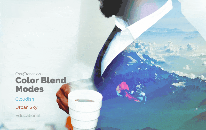
If you want to layer 2 images in this way to get one in the background of another images so that user will feel like one image is getting dissolve inside another image you can use these examples as I am presenting by this article.
This can we fit with your website here section perfectly as your website user will get attracted towards these animations due to which readability of your information will get a boost.
In the same form I have shared two more pure css article hope you will get entertain too by seeing them:
In this article I am sharing three examples for this beautiful layered Animation. You can use it as layered slider too. Each Example can be used as your website here section beautifully and the combination can used as a slider.
So without doing any late let’s start coding:
HTML Structure:
<div class="changer">
  <div class="sub">Css3Transition</div>
  <h1>Color Blend Modes</h1>
  <div class="demos"><a data-go="1">Cloudish</a><a data-go="2">Urban Sky</a><a data-go="3">Educational</a></div>
</div>
<div id="container"></div>
CSS Style sheet:
a:hover {
  cursor: pointer;
}
body,
html {
  height: 100%;
  font-family: 'Raleway', Helvetica, Roboto, Arial, sans-serif;
}
.changer {
  position: absolute;
  z-index: 30;
  width: 230px;
  left: 10%;
  bottom: 10%;
  padding: 0px;
  color: #777777;
}
.changer .sub {
  font-weight: 300;
}
.changer h1 {
  font-size: 2.25em;
  font-weight: 800;
}
.changer .demos {
  line-height: 1;
}
.changer .demos a {
  color: #fff;
  display: block;
  margin: 15px 0;
  font-size: 1.1875em;
}
.changer .demos a[data-go="1"] {
  color: #40BBB8;
}
.changer .demos a[data-go="2"] {
  color: #B24600;
}
.changer .demos a[data-go="3"] {
  color: #98ADA4;
}
#container {
  position: absolute;
  top: 20px;
  left: 20px;
  right: 20px;
  bottom: 20px;
  overflow: hidden;
}
#container > div {
  position: absolute;
  top: 0px;
  left: 0px;
  right: 0px;
  bottom: 0px;
  background-repeat: no-repeat;
  background-size: cover;
  background-position: center center;
}
[data-demo="1"] #container #f1 {
  left: 40%;
  right: auto;
  width: 100%;
  -webkit-animation: roll 60s linear infinite;
  -moz-animation: roll 60s linear infinite;
  animation: roll 60s linear infinite;
  -ms-animation: roll 60s linear infinite;
}
@-moz-keyframes roll {
  50% {
    -webkit-transform: translate(-40%, 0);
    -moz-transform: translate(-40%, 0);
    -ms-transform: translate(-40%, 0);
    -o-transform: translate(-40%, 0);
    transform: translate(-40%, 0);
  }
  100% {
    -webkit-transform: translate(0%, 0);
    -moz-transform: translate(0%, 0);
    -ms-transform: translate(0%, 0);
    -o-transform: translate(0%, 0);
    transform: translate(0%, 0);
  }
}
@-webkit-keyframes roll {
  50% {
    -webkit-transform: translate(-40%, 0);
    -moz-transform: translate(-40%, 0);
    -ms-transform: translate(-40%, 0);
    -o-transform: translate(-40%, 0);
    transform: translate(-40%, 0);
  }
  100% {
    -webkit-transform: translate(0%, 0);
    -moz-transform: translate(0%, 0);
    -ms-transform: translate(0%, 0);
    -o-transform: translate(0%, 0);
    transform: translate(0%, 0);
  }
}
@keyframes roll {
  50% {
    -webkit-transform: translate(-40%, 0);
    -moz-transform: translate(-40%, 0);
    -ms-transform: translate(-40%, 0);
    -o-transform: translate(-40%, 0);
    transform: translate(-40%, 0);
  }
  100% {
    -webkit-transform: translate(0%, 0);
    -moz-transform: translate(0%, 0);
    -ms-transform: translate(0%, 0);
    -o-transform: translate(0%, 0);
    transform: translate(0%, 0);
  }
}
[data-demo="2"] #container #f1 {
  -webkit-animation: zoomin 30s linear infinite;
  -moz-animation: zoomin 30s linear infinite;
  animation: zoomin 30s linear infinite;
  -ms-animation: zoomin 30s linear infinite;
}
@-moz-keyframes zoomin {
  50% {
    -webkit-transform: scale(1.2);
    -moz-transform: scale(1.2);
    -ms-transform: scale(1.2);
    -o-transform: scale(1.2);
    transform: scale(1.2);
  }
  100% {
    -webkit-transform: scale(1);
    -moz-transform: scale(1);
    -ms-transform: scale(1);
    -o-transform: scale(1);
    transform: scale(1);
  }
}
@-webkit-keyframes zoomin {
  50% {
    -webkit-transform: scale(1.2);
    -moz-transform: scale(1.2);
    -ms-transform: scale(1.2);
    -o-transform: scale(1.2);
    transform: scale(1.2);
  }
  100% {
    -webkit-transform: scale(1);
    -moz-transform: scale(1);
    -ms-transform: scale(1);
    -o-transform: scale(1);
    transform: scale(1);
  }
}
@keyframes zoomin {
  50% {
    -webkit-transform: scale(1.2);
    -moz-transform: scale(1.2);
    -ms-transform: scale(1.2);
    -o-transform: scale(1.2);
    transform: scale(1.2);
  }
  100% {
    -webkit-transform: scale(1);
    -moz-transform: scale(1);
    -ms-transform: scale(1);
    -o-transform: scale(1);
    transform: scale(1);
  }
}
[data-demo="2"] #container #f2 {
  -webkit-transform: scale(1.1);
  -moz-transform: scale(1.1);
  -ms-transform: scale(1.1);
  -o-transform: scale(1.1);
  transform: scale(1.1);
  -webkit-animation: zoomout 30s linear infinite;
  -moz-animation: zoomout 30s linear infinite;
  animation: zoomout 30s linear infinite;
  -ms-animation: zoomout 30s linear infinite;
}
@-moz-keyframes zoomout {
  50% {
    -webkit-transform: scale(1);
    -moz-transform: scale(1);
    -ms-transform: scale(1);
    -o-transform: scale(1);
    transform: scale(1);
  }
  100% {
    -webkit-transform: scale(1.1);
    -moz-transform: scale(1.1);
    -ms-transform: scale(1.1);
    -o-transform: scale(1.1);
    transform: scale(1.1);
  }
}
@-webkit-keyframes zoomout {
  50% {
    -webkit-transform: scale(1);
    -moz-transform: scale(1);
    -ms-transform: scale(1);
    -o-transform: scale(1);
    transform: scale(1);
  }
  100% {
    -webkit-transform: scale(1.1);
    -moz-transform: scale(1.1);
    -ms-transform: scale(1.1);
    -o-transform: scale(1.1);
    transform: scale(1.1);
  }
}
@keyframes zoomout {
  50% {
    -webkit-transform: scale(1);
    -moz-transform: scale(1);
    -ms-transform: scale(1);
    -o-transform: scale(1);
    transform: scale(1);
  }
  100% {
    -webkit-transform: scale(1.1);
    -moz-transform: scale(1.1);
    -ms-transform: scale(1.1);
    -o-transform: scale(1.1);
    transform: scale(1.1);
  }
}
[data-demo="2"] #container #f3 {
  -webkit-transform: scale(1.1);
  -moz-transform: scale(1.1);
  -ms-transform: scale(1.1);
  -o-transform: scale(1.1);
  transform: scale(1.1);
  -webkit-animation: zoomout 30s linear infinite;
  -moz-animation: zoomout 30s linear infinite;
  animation: zoomout 30s linear infinite;
  -ms-animation: zoomout 30s linear infinite;
}
[data-demo="3"] #container #f1 {
  -webkit-transform: translate(10%, 0%);
  -moz-transform: translate(10%, 0%);
  -ms-transform: translate(10%, 0%);
  -o-transform: translate(10%, 0%);
  transform: translate(10%, 0%);
  opacity: 0;
  -webkit-opacity: 0;
  -moz-opacity: 0;
  -webkit-animation: opa 40s linear infinite;
  -moz-animation: opa 40s linear infinite;
  animation: opa 40s linear infinite;
  -ms-animation: opa 40s linear infinite;
}
@-moz-keyframes opa {
  30% {
    opacity: 1;
    -webkit-opacity: 1;
    -moz-opacity: 1;
  }
  50% {
    opacity: 1;
    -webkit-opacity: 1;
    -moz-opacity: 1;
    -webkit-transform: translate(0%, 0%);
    -moz-transform: translate(0%, 0%);
    -ms-transform: translate(0%, 0%);
    -o-transform: translate(0%, 0%);
    transform: translate(0%, 0%);
  }
  70% {
    opacity: 1;
    -webkit-opacity: 1;
    -moz-opacity: 1;
  }
  100% {
    opacity: 0;
    -webkit-opacity: 0;
    -moz-opacity: 0;
    -webkit-transform: translate(10%, 0%);
    -moz-transform: translate(10%, 0%);
    -ms-transform: translate(10%, 0%);
    -o-transform: translate(10%, 0%);
    transform: translate(10%, 0%);
  }
}
@-webkit-keyframes opa {
  30% {
    opacity: 1;
    -webkit-opacity: 1;
    -moz-opacity: 1;
  }
  50% {
    opacity: 1;
    -webkit-opacity: 1;
    -moz-opacity: 1;
    -webkit-transform: translate(0%, 0%);
    -moz-transform: translate(0%, 0%);
    -ms-transform: translate(0%, 0%);
    -o-transform: translate(0%, 0%);
    transform: translate(0%, 0%);
  }
  70% {
    opacity: 1;
    -webkit-opacity: 1;
    -moz-opacity: 1;
  }
  100% {
    opacity: 0;
    -webkit-opacity: 0;
    -moz-opacity: 0;
    -webkit-transform: translate(10%, 0%);
    -moz-transform: translate(10%, 0%);
    -ms-transform: translate(10%, 0%);
    -o-transform: translate(10%, 0%);
    transform: translate(10%, 0%);
  }
}
@keyframes opa {
  30% {
    opacity: 1;
    -webkit-opacity: 1;
    -moz-opacity: 1;
  }
  50% {
    opacity: 1;
    -webkit-opacity: 1;
    -moz-opacity: 1;
    -webkit-transform: translate(0%, 0%);
    -moz-transform: translate(0%, 0%);
    -ms-transform: translate(0%, 0%);
    -o-transform: translate(0%, 0%);
    transform: translate(0%, 0%);
  }
  70% {
    opacity: 1;
    -webkit-opacity: 1;
    -moz-opacity: 1;
  }
  100% {
    opacity: 0;
    -webkit-opacity: 0;
    -moz-opacity: 0;
    -webkit-transform: translate(10%, 0%);
    -moz-transform: translate(10%, 0%);
    -ms-transform: translate(10%, 0%);
    -o-transform: translate(10%, 0%);
    transform: translate(10%, 0%);
  }
}
JavaScript code:
var demos = [];


var cloudsuit = {
	one : {
		bg: "http://caraujo_pens.surge.sh/images/ZnkfwAR.jpg",
		bm: "none"
	},
	two : {
		bg: "http://caraujo_pens.surge.sh/images/ONBXKkS.jpg",
		bm: "lighten"
	},
	three : {
		bg: "http://caraujo_pens.surge.sh/images/qKNpn9G.png",
		bm: "multiply"
	}
}
demos.push(cloudsuit);


var urbansky = {
	one : {
		bg: "http://caraujo_pens.surge.sh/images/l1MS7kk.jpg",
		bm: "none"
	},
	two : {
		bg: "http://caraujo_pens.surge.sh/images/6QBLNy6.jpg",
		bm: "multiply"
	},
	three : {
		bg: "http://caraujo_pens.surge.sh/images/bmnzJRs.png",
		bm: "none"
	}
}
demos.push(urbansky);


var knowledge = {
	one : {
		bg: "http://caraujo_pens.surge.sh/images/YpTSfYD.jpg",
		bm: "none"
	},
	two : {
		bg: "http://caraujo_pens.surge.sh/images/ziAdjNM.jpg",
		bm: "multiply"
	},
	three : {
		bg: "http://caraujo_pens.surge.sh/images/dnfONso.png",
		bm: "none"
	}
}
demos.push(knowledge);


var container = document.getElementById("container");
var active;
var applyDemo = function(number){
	console.log(number);
	var go = demos[number-1];

	container.innerHTML = "";


	var f1 = document.createElement("div");
	f1.setAttribute("id", "f1");
	var style = "background-image: url(" + go.one.bg + "); mix-blend-mode: " + go.one.bm + ";";
	f1.setAttribute("style", style);
	container.appendChild(f1);


	var f2 = document.createElement("div");
	f2.setAttribute("id", "f2");
	var style = "background-image: url(" + go.two.bg + "); mix-blend-mode: " + go.two.bm + ";";
	f2.setAttribute("style", style);
	container.appendChild(f2);

	var f3 = document.createElement("div");
	f3.setAttribute("id", "f3");
	var style = "background-image: url(" + go.three.bg + "); mix-blend-mode: " + go.three.bm + ";";
	f3.setAttribute("style", style);
	container.appendChild(f3);
	active = number;

	document.body.setAttribute("data-demo", number);
}
applyDemo(1);


$('.demos').on('click', 'a', function(event) {
	event.preventDefault();
	var t = this;

	if(active == t.getAttribute("data-go")) return;

	$(container).fadeOut({
		duration: 1000,
		complete: function(){
			applyDemo(t.getAttribute("data-go"));
			$(container).fadeIn(1000);
		}
	});
});
Note: Do not forgot the include latest jquery library before this javascript code written above :)