


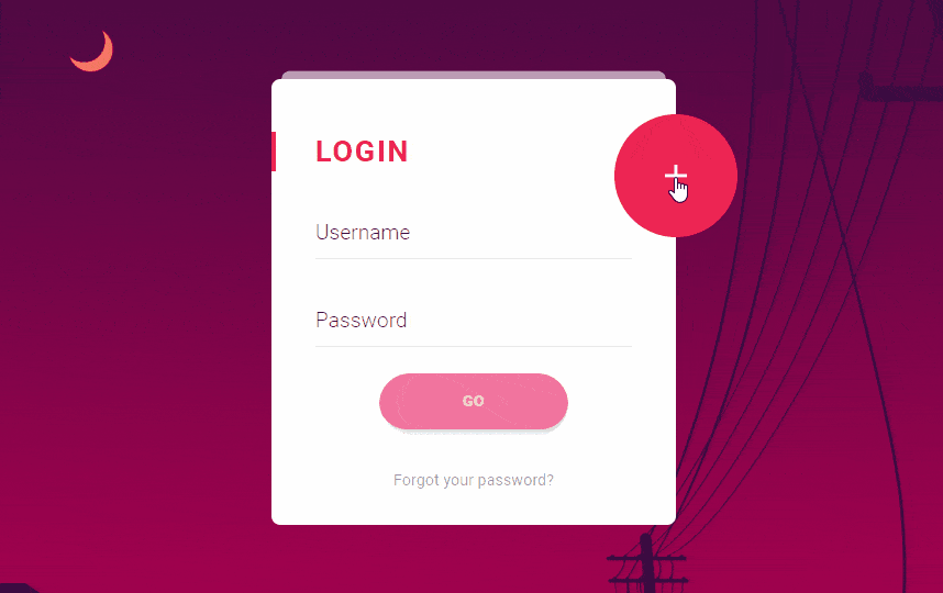
Hello all, today I am sharing a beautiful Material Design Login Form Animation where you click on plug icon register form will be animation and if you click on close icon by default login form will be visible with a fantastic animation. As I have shared in my last two article which was very popular among in my website visitor which is Direction Aware 3D hover Effects and Stacked Animated UI Level using CSS you may also like it.
Login are mostly used everywhere on the web. We can also see these forms in social media networks, email, word press and forums. First of all you have to register, we leaves some information behind when we register for any forum or web or social media. Now this is very common in the internet to get access of any website.
These Login or Sign up forms can be created by using HTML and CSS. With the help of HTML website block are created, in every website Markup Codes are used. CSS is a language which is used to describe the look and formatting of the web page to make it more effective and look fantastic which is written in HTML.
HTML and CSS are used to build websites with effective appearance. It is now common every websites having Sign-up and Login form, which gives the confidentiality and security to the websites.
Lets Start Coding:
Note: Use Latest jquery along with this Material Design Login Form Animation to Get on Click Animation.
Markup Code(HTML):
<div class="materialContainer">


   <div class="box">

      <div class="title">LOGIN</div>

      <div class="input">
         <label for="name">Username</label>
         <input type="text" name="name" id="name">
         <span class="spin"></span>
      </div>

      <div class="input">
         <label for="pass">Password</label>
         <input type="password" name="pass" id="pass">
         <span class="spin"></span>
      </div>

      <div class="button login">
         <button><span>GO</span> <i class="fa fa-check"></i></button>
      </div>

      <a href="" class="pass-forgot">Forgot your password?</a>

   </div>

   <div class="overbox">
      <div class="material-button alt-2"><span class="shape"></span></div>

      <div class="title">REGISTER</div>

      <div class="input">
         <label for="regname">Username</label>
         <input type="text" name="regname" id="regname">
         <span class="spin"></span>
      </div>

      <div class="input">
         <label for="regpass">Password</label>
         <input type="password" name="regpass" id="regpass">
         <span class="spin"></span>
      </div>

      <div class="input">
         <label for="reregpass">Repeat Password</label>
         <input type="password" name="reregpass" id="reregpass">
         <span class="spin"></span>
      </div>

      <div class="button">
         <button><span>NEXT</span></button>
      </div>


   </div>

</div>
Stylesheet:
.box {
    background: rgb(255, 255, 255) none repeat scroll 0 0;
    border-radius: 10px;
    float: left;
    opacity: 1;
    padding: 60px 50px 40px;
    position: relative;
    top: 0;
    transform: scale(1);
    width: 100%;
    z-index: 5;
}
.box.back {
    opacity: 0.8;
    top: -20px;
    transform: scale(0.95);
    z-index: -1;
}
.box::before {
    background: rgba(255, 255, 255, 0.6) none repeat scroll 0 0;
    border-radius: 10px;
    content: "";
    height: 30px;
    left: 0;
    position: absolute;
    top: -10px;
    transform: scale(0.95);
    width: 100%;
    z-index: -1;
}
.overbox .title {
    color: rgb(255, 255, 255);
}
.overbox .title::before {
    background: rgb(255, 255, 255) none repeat scroll 0 0;
}
.title {
    color: rgb(237, 37, 83);
    float: left;
    font-size: 34px;
    font-weight: 700;
    letter-spacing: 2px;
    line-height: 46px;
    position: relative;
    width: 100%;
}
.title::before {
    background: rgb(237, 37, 83) none repeat scroll 0 0;
    content: "";
    height: 100%;
    left: -50px;
    position: absolute;
    top: 0;
    width: 5px;
}
.input, .input label, .input input, .input .spin, .button, .button button .button.login button i.fa, .material-button .shape::before, .material-button .shape::after, .button.login button {
    transition: all 300ms cubic-bezier(0.4, 0, 0.2, 1) 0s;
}
.material-button, .alt-2, .material-button .shape, .alt-2 .shape, .box {
    transition: all 400ms cubic-bezier(0.4, 0, 0.2, 1) 0s;
}
.input, .input label, .input input, .input .spin, .button, .button button {
    float: left;
    width: 100%;
}
.input, .button {
    height: 70px;
    margin-top: 30px;
}
.input, .input input, .button, .button button {
    position: relative;
}
.input input {
    background: rgba(0, 0, 0, 0) none repeat scroll 0 0;
    border: medium none;
    height: 60px;
    top: 10px;
}
.input input, .input label, .button button {
    color: rgba(0, 0, 0, 0.8);
    font-family: "Roboto",sans-serif;
    font-size: 24px;
    font-weight: 300;
}
.input::before, .input .spin {
    bottom: 0;
    height: 1px;
    left: 0;
    position: absolute;
    width: 100%;
}
.input::before {
    background: rgba(0, 0, 0, 0.1) none repeat scroll 0 0;
    content: "";
    z-index: 3;
}
.input .spin {
    background: rgb(237, 37, 83) none repeat scroll 0 0;
    width: 0;
    z-index: 4;
}
.overbox .input .spin {
    background: rgb(255, 255, 255) none repeat scroll 0 0;
}
.overbox .input::before {
    background: rgba(255, 255, 255, 0.5) none repeat scroll 0 0;
}
.input label {
    cursor: pointer;
    left: 0;
    line-height: 60px;
    position: absolute;
    top: 10px;
    z-index: 2;
}
.button.login {
    left: 20%;
    width: 60%;
}
.button.login button, .button button {
    background-color: rgb(236, 64, 122);
    border-radius: 50px;
    box-shadow: 5px 5px 10px rgba(0, 0, 0, 0.15);
    color: rgb(255, 255, 255);
    font-size: 18px;
    font-weight: 900;
    left: 0;
    line-height: 64px;
    width: 100%;
	transition: all 0.5s ease;
	border:0px solid #fff;
	box-sizing: border-box;
}
.button.login {
    margin-top: 30px;
}
.button {
    margin-top: 20px;
}
.button button {
    background-color: rgb(255, 255, 255);
    border: medium none;
    color: rgb(237, 37, 83);
}
.button.login button.active {
    border: 3px solid rgba(0, 0, 0, 0);
    color: rgb(255, 255, 255);
}
.button.login button.active:hover {
    border: 3px solid rgba(0, 0, 0, 0);
    color: rgb(255, 255, 255);
}
.button.login button.active span {
    opacity: 0;
    transform: scale(0);
}
.button.login button.active i.fa {
    opacity: 1;
    transform: scale(1) rotate(0deg);
}
.button.login button i.fa {
    height: 100%;
    left: 0;
    line-height: 60px;
    position: absolute;
    top: 0;
    transform: scale(0) rotate(-45deg);
    width: 100%;
}
.button.login button:hover {
    color: rgb(237, 37, 83);
	background:none;
	box-shadow: 0px 0px 10px rgba(0,0,0,0.2);

}
.button {
    margin: 40px 0;
    z-index: 2;
	border-radius: 50px;
    overflow: hidden;
}
.button button {
    cursor: pointer;
    position: relative;
    z-index: 2;

}
.pass-forgot {
    color: rgba(0, 0, 0, 0.4);
    float: left;
    font-size: 18px;
    text-align: center;
    width: 100%;
}
.click-efect {
    background: rgb(237, 37, 83) none repeat scroll 0 0;
    border-radius: 50%;
    left: 0;
    position: absolute;
    top: 0;
}
.overbox {
    border-radius: 10px;
    height: 100%;
    left: 0;
    overflow: inherit;
    padding: 60px 50px 40px;
    position: absolute;
    top: 0;
    width: 100%;
}
.overbox .title, .overbox .button, .overbox .input {
    color: rgb(255, 255, 255);
    display: none;
    position: relative;
    z-index: 111;
}
.overbox .title {
    width: 80%;
}
.overbox .input {
    margin-top: 20px;
}
.overbox .input input, .overbox .input label {
    color: rgb(255, 255, 255);
}
.overbox .material-button, .overbox .material-button .shape, .overbox .alt-2, .overbox .alt-2 .shape {
    display: block;
}
.material-button, .alt-2 {
    background: rgb(237, 37, 83) none repeat scroll 0 0;
    border-radius: 50%;
    cursor: pointer;
    height: 140px;
    position: absolute;
    right: -70px;
    top: 40px;
    transform: translate(0%, 0%);
    width: 140px;
    z-index: 100;
}
.material-button .shape, .alt-2 .shape {
    height: 100%;
    position: absolute;
    right: 0;
    top: 0;
    width: 100%;
}
.material-button .shape::before, .alt-2 .shape::before, .material-button .shape::after, .alt-2 .shape::after {
    background: rgb(255, 255, 255) none repeat scroll 0 0;
    content: "";
    left: 50%;
    position: absolute;
    top: 50%;
    transform: translate(-50%, -50%) rotate(360deg);
}
.material-button .shape::before, .alt-2 .shape::before {
    height: 4px;
    width: 25px;
}
.material-button .shape::after, .alt-2 .shape::after {
    height: 25px;
    width: 4px;
}
.material-button.active, .alt-2.active {
    right: 50%;
    top: 50%;
    transform: translate(50%, -50%) rotate(0deg);
}
body {
    background-image: url(../image/bg.png);
    background-position: center center;
    background-repeat: no-repeat;
    background-size: cover;
    font-family: "Roboto",sans-serif;
    min-height: 100vh;
}
body, html {
    overflow: hidden;
}
.materialContainer {
    left: 50%;
    max-width: 460px;
    position: absolute;
    top: 50%;
    transform: translate(-50%, -50%);
    width: 100%;
}
*, *::after, *::before {
    box-sizing: border-box;
    list-style-type: none;
    margin: 0;
    outline: medium none;
    padding: 0;
    text-decoration: none;
}
jQuery :
$(function() {

   $(".input input").focus(function() {

      $(this).parent(".input").each(function() {
         $("label", this).css({
            "line-height": "18px",
            "font-size": "18px",
            "font-weight": "100",
            "top": "0px"
         })
         $(".spin", this).css({
            "width": "100%"
         })
      });
   }).blur(function() {
      $(".spin").css({
         "width": "0px"
      })
      if ($(this).val() == "") {
         $(this).parent(".input").each(function() {
            $("label", this).css({
               "line-height": "60px",
               "font-size": "24px",
               "font-weight": "300",
               "top": "10px"
            })
         });

      }
   });

   $(".button").click(function(e) {
      var pX = e.pageX,
         pY = e.pageY,
         oX = parseInt($(this).offset().left),
         oY = parseInt($(this).offset().top);

      $(this).append('<span class="click-efect x-' + oX + ' y-' + oY + '" style="margin-left:' + (pX - oX) + 'px;margin-top:' + (pY - oY) + 'px;"></span>')
      $('.x-' + oX + '.y-' + oY + '').animate({
         "width": "500px",
         "height": "500px",
         "top": "-250px",
         "left": "-250px",

      }, 600);
      $("button", this).addClass('active');
   })

   $(".alt-2").click(function() {
      if (!$(this).hasClass('material-button')) {
         $(".shape").css({
            "width": "100%",
            "height": "100%",
            "transform": "rotate(0deg)"
         })

         setTimeout(function() {
            $(".overbox").css({
               "overflow": "initial"
            })
         }, 600)

         $(this).animate({
            "width": "140px",
            "height": "140px"
         }, 500, function() {
            $(".box").removeClass("back");

            $(this).removeClass('active')
         });

         $(".overbox .title").fadeOut(300);
         $(".overbox .input").fadeOut(300);
         $(".overbox .button").fadeOut(300);

         $(".alt-2").addClass('material-buton');
      }

   })

   $(".material-button").click(function() {

      if ($(this).hasClass('material-button')) {
         setTimeout(function() {
            $(".overbox").css({
               "overflow": "hidden"
            })
            $(".box").addClass("back");
         }, 200)
         $(this).addClass('active').animate({
            "width": "700px",
            "height": "700px"
         });

         setTimeout(function() {
            $(".shape").css({
               "width": "50%",
               "height": "50%",
               "transform": "rotate(45deg)"
            })

            $(".overbox .title").fadeIn(300);
            $(".overbox .input").fadeIn(300);
            $(".overbox .button").fadeIn(300);
         }, 700)

         $(this).removeClass('material-button');

      }

      if ($(".alt-2").hasClass('material-buton')) {
         $(".alt-2").removeClass('material-buton');
         $(".alt-2").addClass('material-button');
      }

   });

});