
Hi All, today I am going to share with you some experiment with adjacent and sibling combinatory and :checked pseudo-class. Using hidden input and labels we will create an accordion that will Animate the area of content by opening and closing them.
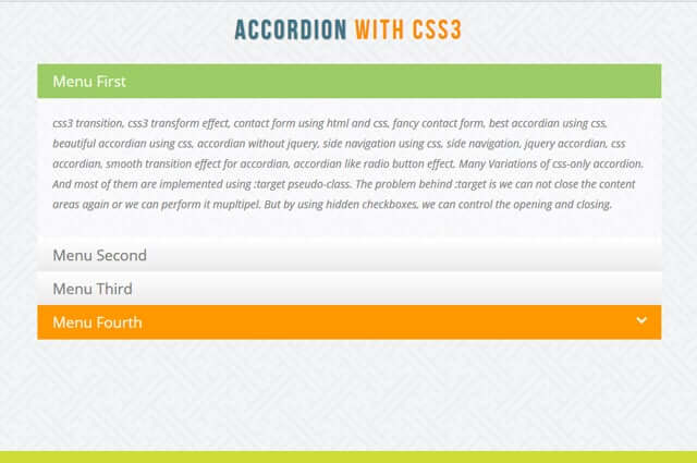
Many Variations of css-only accordion. And most of them are implemented using :target pseudo-class. The problem behind :target is we can not close the content areas again or we can perform it mupltipel. But by using hidden checkboxes, we can control the opening and closing. And by using radio button you can open only one content area on click.
So, let start!
Please note: the result of this tutorial will only work as intended in browsers that support the CSS3 properties in use.
For More Details please check it with code
Accordion Html struture :
<div class="container">
			<!-- Codrops top bar -->

			<header>
				<h1>Accordion <span>with CSS3</span></h1>

			</header>
			<section class="ac-container">
				<div>
					<input id="ac-1" name="accordion-1" type="radio" checked />
					<label for="ac-1">Menu First</label>
					<article class="ac-small">
						<p>css3 transition, css3 transform effect, contact form using html and css, fancy contact form, best accordian using css, beautiful accordian using css, accordian without jquery, side navigation using css, side navigation, jquery accordian, css accordian, smooth transition effect for accordian, accordian like radio button effect. Many Variations of css-only accordion. And most of them are implemented using :target pseudo-class.  The problem behind :target is we can not close the content areas again or we can perform it mupltipel. But by using hidden checkboxes, we can control the opening and closing. </p>
					</article>
				</div>
				<div>
					<input id="ac-2" name="accordion-1" type="radio" />
					<label for="ac-2">Menu Second</label>
					<article class="ac-medium">
						<p>css3 transition, css3 transform effect, contact form using html and css, fancy contact form, best accordian using css, beautiful accordian using css, accordian without jquery, side navigation using css, side navigation, jquery accordian, css accordian. Many Variations of css-only accordion. And most of them are implemented using :target pseudo-class.  The problem behind :target is we can not close the content areas again or we can perform it mupltipel. But by using hidden checkboxes, we can control the opening and closing. </p>
					</article>
				</div>
				<div>
					<input id="ac-3" name="accordion-1" type="radio" />
					<label for="ac-3">Menu Third</label>
					<article class="ac-large">
						<p>css3 transition, css3 transform effect, contact form using html and css, fancy contact form, best accordian using css, beautiful accordian using css, accordian without jquery, side navigation using css, side navigation, jquery accordian, css accordian, accordian with smooth transition effect using css3 transition. Many Variations of css-only accordion. And most of them are implemented using :target pseudo-class.  The problem behind :target is we can not close the content areas again or we can perform it mupltipel. But by using hidden checkboxes, we can control the opening and closing. </p>
					</article>
				</div>
				<div>
					<input id="ac-4" name="accordion-1" type="radio" />
					<label for="ac-4">Menu Fourth</label>
					<article class="ac-large">
						<p>css3 transition, css3 transform effect, contact form using html and css, fancy contact form, best accordian using css, beautiful accordian using css, accordian without jquery, side navigation using css, side navigation, jquery accordian, css accordian ,beautiful accordian without jquery. Many Variations of css-only accordion. And most of them are implemented using :target pseudo-class.  The problem behind :target is we can not close the content areas again or we can perform it mupltipel. But by using hidden checkboxes, we can control the opening and closing. </p>
					</article>
				</div>
			</section>
        </div>
Css Code for Accordion styling:
.ac-container{
	width: 800px;
	max-width:100%;
	margin: 10px auto 30px auto;
	text-align: left;
}
.ac-container label{
	font-family: 'open sans', Arial, sans-serif;
	padding: 5px 20px 9px 20px;
	position: relative;
	z-index: 20;
	display: block;
	height: 30px;
	cursor: pointer;
	color: #777;
	/*text-shadow: 1px 1px 1px rgba(255,255,255,0.8);*/
	line-height: 33px;
	font-size: 19px;
	background: #ffffff;
	background: -moz-linear-gradient(top, #ffffff 1%, #eaeaea 100%);
	background: -webkit-gradient(linear, left top, left bottom, color-stop(1%,#ffffff), color-stop(100%,#eaeaea));
	background: -webkit-linear-gradient(top, #ffffff 1%,#eaeaea 100%);
	background: -o-linear-gradient(top, #ffffff 1%,#eaeaea 100%);
	background: -ms-linear-gradient(top, #ffffff 1%,#eaeaea 100%);
	background: linear-gradient(top, #ffffff 1%,#eaeaea 100%);
	filter: progid:DXImageTransform.Microsoft.gradient( startColorstr='#ffffff', endColorstr='#eaeaea',GradientType=0 );
	/*box-shadow:
		0px 0px 0px 1px rgba(155,155,155,0.3),
		1px 0px 0px 0px rgba(255,255,255,0.9) inset,
		0px 2px 2px rgba(0,0,0,0.1);*/
}
.ac-container label:hover{
	background: #FF9800;
	color:#ffffff;
}
.ac-container input:checked + label,
.ac-container input:checked + label:hover{
	background: #9CCC65;
	color: #ffffff;
	/*text-shadow: 0px 1px 1px rgba(255,255,255, 0.6);
*/	/*box-shadow:
		0px 0px 0px 1px rgba(155,155,155,0.3),
		0px 2px 2px rgba(0,0,0,0.1);*/
}
.ac-container label:hover:after,
.ac-container input:checked + label:hover:after{
	content: '';
	position: absolute;
	width: 24px;
	height: 24px;
	right: 13px;
	top: 7px;
	background: transparent url(../images/arrow_down.png) no-repeat center center;
}
.ac-container input:checked + label:hover:after{
	background-image: url(../images/arrow_up.png);
}
.ac-container input{
	display: none;
}
.ac-container article{
	background: rgba(255, 255, 255, 0.5);
	margin-top: -1px;
	overflow: hidden;
	height: 0px;
	position: relative;
	z-index: 10;
	-webkit-transition: height 0.3s ease-in-out, box-shadow 0.6s linear;
	-moz-transition: height 0.3s ease-in-out, box-shadow 0.6s linear;
	-o-transition: height 0.3s ease-in-out, box-shadow 0.6s linear;
	-ms-transition: height 0.3s ease-in-out, box-shadow 0.6s linear;
	transition: height 0.3s ease-in-out, box-shadow 0.6s linear;
}
.ac-container article p{
	font-style: italic;
	color: #777;
	line-height: 26px;
	font-size: 14px;
	padding: 20px;
	text-shadow: 1px 1px 1px rgba(255,255,255,0.8);
}
.ac-container input:checked ~ article{
	-webkit-transition: height 0.5s ease-in-out, box-shadow 0.1s linear;
	-moz-transition: height 0.5s ease-in-out, box-shadow 0.1s linear;
	-o-transition: height 0.5s ease-in-out, box-shadow 0.1s linear;
	-ms-transition: height 0.5s ease-in-out, box-shadow 0.1s linear;
	transition: height 0.5s ease-in-out, box-shadow 0.1s linear;
	/*box-shadow: 0px 0px 0px 1px rgba(155,155,155,0.3); */
}
.ac-container input:checked ~ article.ac-small{
	height: 180px;
}
.ac-container input:checked ~ article.ac-medium{
	height: 180px;
}
.ac-container input:checked ~ article.ac-large{
	height: 180px;
}
Another css code for accordion parent structure:
@font-face {
    font-family: 'BebasNeueRegular';
    src: url('fonts/BebasNeue-webfont.eot');
    src: url('fonts/BebasNeue-webfont.eot?#iefix') format('embedded-opentype'),
         url('fonts/BebasNeue-webfont.woff') format('woff'),
         url('fonts/BebasNeue-webfont.ttf') format('truetype'),
         url('fonts/BebasNeue-webfont.svg#BebasNeueRegular') format('svg');
    font-weight: normal;
    font-style: normal;
}
/* CSS reset */
body,div,dl,dt,dd,ul,ol,li,h1,h2,h3,h4,h5,h6,pre,form,fieldset,input,textarea,p,blockquote,th,td {
	margin:0;
	padding:0;
}
html,body {
	margin:0;
	padding:0;
}
table {
	border-collapse:collapse;
	border-spacing:0;
}
fieldset,img {
	border:0;
}
address,caption,cite,code,dfn,th,var {
	font-style:normal;
	font-weight:normal;
}
ol,ul {
	list-style:none;
}
caption,th {
	text-align:left;
}
h1,h2,h3,h4,h5,h6 {
	font-size:100%;
	font-weight:normal;
}
q:before,q:after {
	content:'';
}
abbr,acronym { border:0;
}
section, header{
	display: block;
}
/* General Demo Style */
body{
	font-family: 'open sans', Georgia, serif;
	background: #e0e3ec url(../images/bg2.png) repeat top left;
	font-weight: 400;
	font-size: 15px;
	color: #393b40;
	overflow-y: scroll;
}
a{
	color: #333;
	text-decoration: none;
}
.container{
	width: 100%;
	position: relative;
	text-align: center;
}
.clr{
	clear: both;
}
.container > header{
	padding: 20px 30px 10px 30px;
	margin: 0px 20px 10px 20px;
	position: relative;
	display: block;
	text-shadow: 1px 1px 1px rgba(0,0,0,0.2);
    text-align: center;
}
.container > header h1{
	font-family: 'BebasNeueRegular', 'Arial Narrow', Arial, sans-serif;
	font-size: 35px;
	line-height: 35px;
	position: relative;
	font-weight: 400;
	color: #3d7489;
	text-shadow: 1px 1px 1px rgba(0,0,0,0.3);
    padding: 0px 0px 5px 0px;
	letter-spacing:3px;
}
.container > header h1 span{
	color: #FB8C00;
	text-shadow: 0px 1px 1px rgba(255,255,255,0.8);
	letter-spacing:3px;
}
.container > header h2{
	font-size: 16px;
	font-style: italic;
	color: #82858e;
	text-shadow: 0px 1px 1px rgba(255,255,255,0.8);
}
/* Header Style */
.codrops-top{
	line-height: 24px;
	font-size: 11px;
	background: rgba(255, 255, 255, 0.6);
	text-transform: uppercase;
	z-index: 9999;
	position: relative;
	box-shadow: 1px 0px 2px rgba(0,0,0,0.2);
}
.codrops-top a{
	padding: 0px 10px;
	letter-spacing: 1px;
	color: #333;
	text-shadow: 0px 1px 1px #fff;
	display: block;
	float: left;
}
.codrops-top a:hover{
	background: #fff;
}
.codrops-top span.right{
	float: right;
}
.codrops-top span.right a{
	float: left;
	display: block;
}

p.codrops-demos{
	text-align:center;
	display: block;
	padding: 14px;
}
p.codrops-demos a,
p.codrops-demos a.current-demo,
p.codrops-demos a.current-demo:hover{
    display: inline-block;
	border: 1px solid #7FB2C1;
	padding: 4px 10px 3px;
	font-size: 13px;
	line-height: 18px;
	margin: 0px 3px;
	font-weight: 800;
	-webkit-box-shadow: 0px 1px 1px rgba(0,0,0,0.1);
	-moz-box-shadow:0px 1px 1px rgba(0,0,0,0.1);
	box-shadow: 0px 1px 1px rgba(0,0,0,0.1);
	color: #fff;
	text-shadow: 1px 1px 1px rgba(0,0,0,0.6);
	-webkit-border-radius: 5px;
	-moz-border-radius: 5px;
	border-radius: 5px;
	background: #b0d4e3;
	background: -moz-linear-gradient(top, #b0d4e3 0%, #88bacf 100%);
	background: -webkit-gradient(linear, left top, left bottom, color-stop(0%,#b0d4e3), color-stop(100%,#88bacf));
	background: -webkit-linear-gradient(top, #b0d4e3 0%,#88bacf 100%);
	background: -o-linear-gradient(top, #b0d4e3 0%,#88bacf 100%);
	background: -ms-linear-gradient(top, #b0d4e3 0%,#88bacf 100%);
	background: linear-gradient(top, #b0d4e3 0%,#88bacf 100%);
	filter: progid:DXImageTransform.Microsoft.gradient( startColorstr='#b0d4e3', endColorstr='#88bacf',GradientType=0 );
}
p.codrops-demos a:hover{
	background: #80B8CE;
}
p.codrops-demos a:active{
	-webkit-box-shadow: 0px 1px 1px rgba(255,255,255,0.4);
	-moz-box-shadow: 0px 1px 1px rgba(255,255,255,0.4);
	box-shadow: 0px 1px 1px rgba(255,255,255,0.4);
}
p.codrops-demos a.current-demo,
p.codrops-demos a.current-demo:hover{
	color: #3d7489;
	text-shadow: 0px 1px 1px rgba(255,255,255,0.3);
}
/* Media Queries */
@media screen and (max-width: 767px) {
	.container > header{
		text-align: center;
	}
	p.codrops-demos {
		position: relative;
		top: auto;
		left: auto;
	}
}


It’s laborious to seek out knowledgeable folks on this matter, however you sound like you already know what you’re talking about! Thanks