
We are going to give you a complete tour about CSS Flexbox layout. In this we will cover almost every aspect about flexible box, Our focus is to cover all properties for the parent element which is also know as flex container and the child elements as will which is called flex items in term of flex-box. we will provide you demos for every properties with some brief so that you can understand it very easily.
First of all i am going to clear what will be my today’s agenda:
Introduction
- What is Flex
- Why we need Flex
Flex Syntax & Properties
- Flex Display
- Flex-direction
- Flex-wrap
- Flex-flow
- Justify-content
- Align-items
- flex: none | flex-grow flex-shrink flex-basis
- Flex order
We love Floats
It’s a question not a statement.
Nowdays with floats we are facing too many issues that needed to fix but before fixing lets find out what are the issues currently we are facing with elemenets floats.
- Weird behaving
- Clearfix
- Cross- browser issues
- Parent container breaking
- Content spill over
What you want to change?
- Flexible parent container
- No floats Hack
- no clear fix
- adjustable child container
What is Flex?
CSS Layout Module – Flexbox offers greater control over arranging components of web pages items along one axis.
The Flexible Box Layout Module, makes it easier to design flexible responsive layout structure without using float or positioning.
- Flexbox or Flexible box is the css3 property
- Flexbox is the layout mode
- Improvement over the Floats
- It helps in displaying the elements on the page as per
- Ability to make all neighboring items the same height
- It helps in achieving the grid layout
- Easy horizontal and vertical centering
- Ability to change the display order of the items independent of the html soruce
Let’s Meet the Flex (Flex Vocabulary)
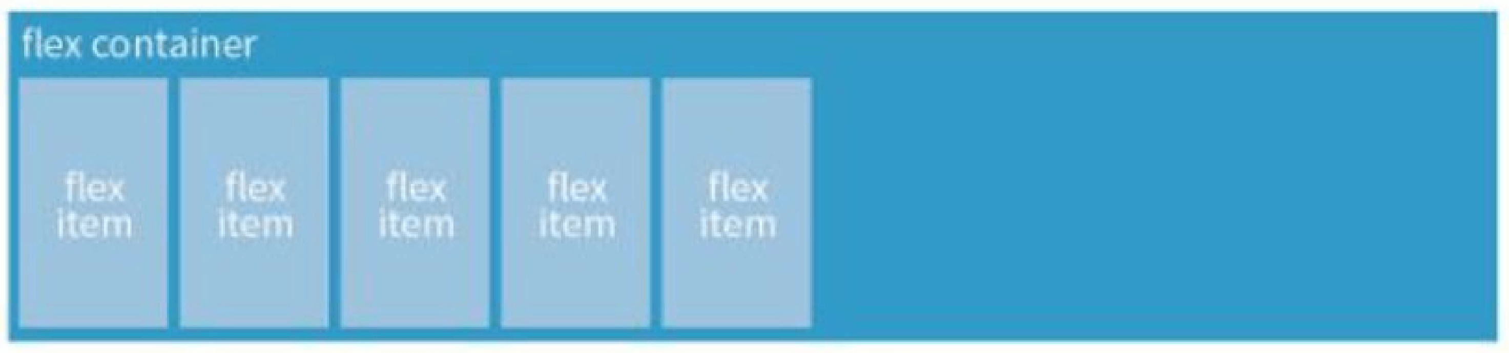
Flexbox Container {}
You can create a flex container by setting the ele’s display property to flex|inline-flex
1 2 3 4 | .flex-container{ display: flex; } |
1 2 3 4 | .flex-container{ display: inline-flex; } |
Display: flex creates a block-level flex container
Display: inline-flex creates a inline-level flex container
Flex items {}
applying the flex display mode turns the child elements of the flex container into flex items
Note: You can turn any flex item into a flex container by setting its display to flex (resulting in nested flexbox)
Flex Container – Properties {}
Flex container properties allow you to control how items appear within the container
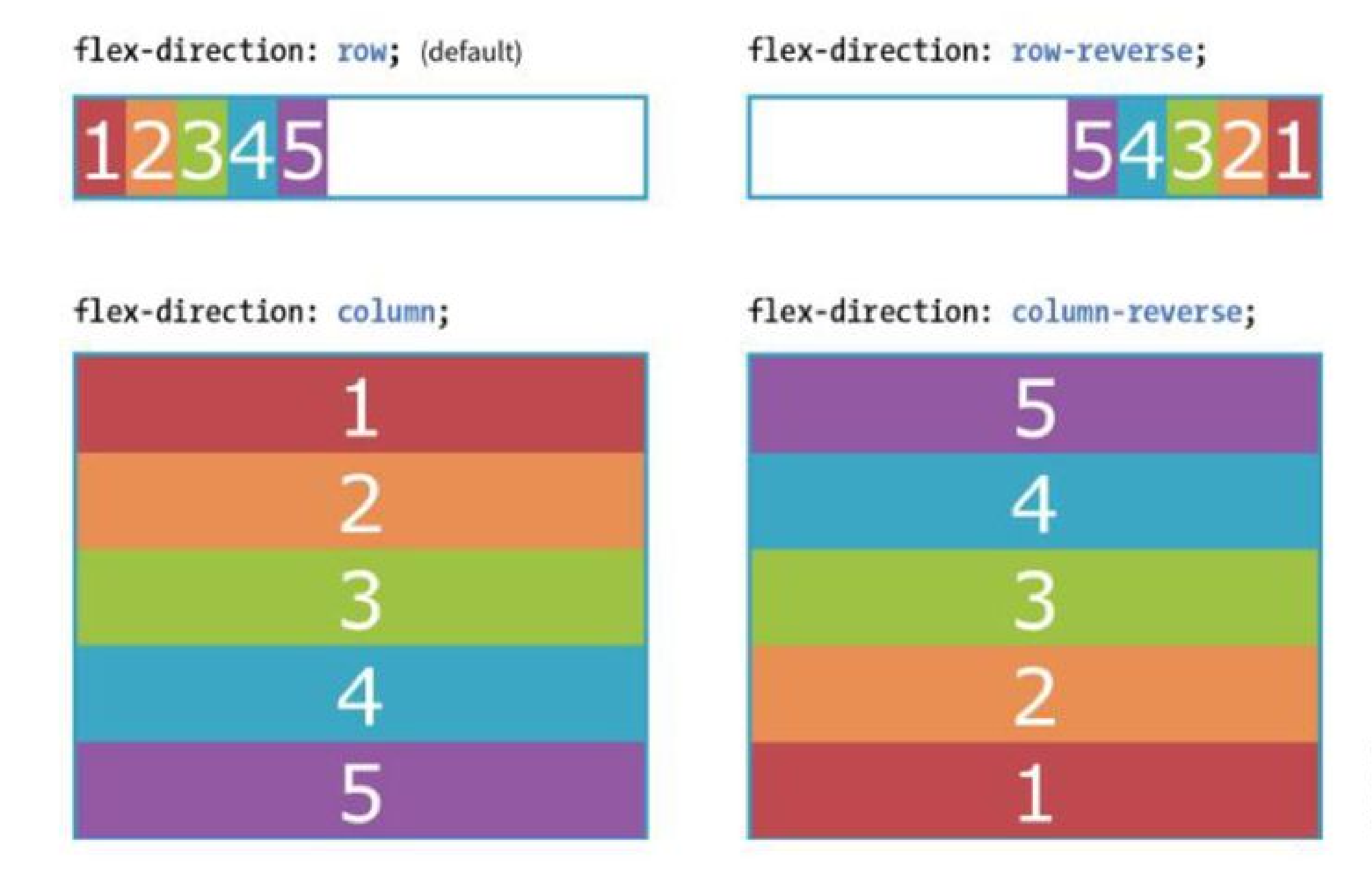
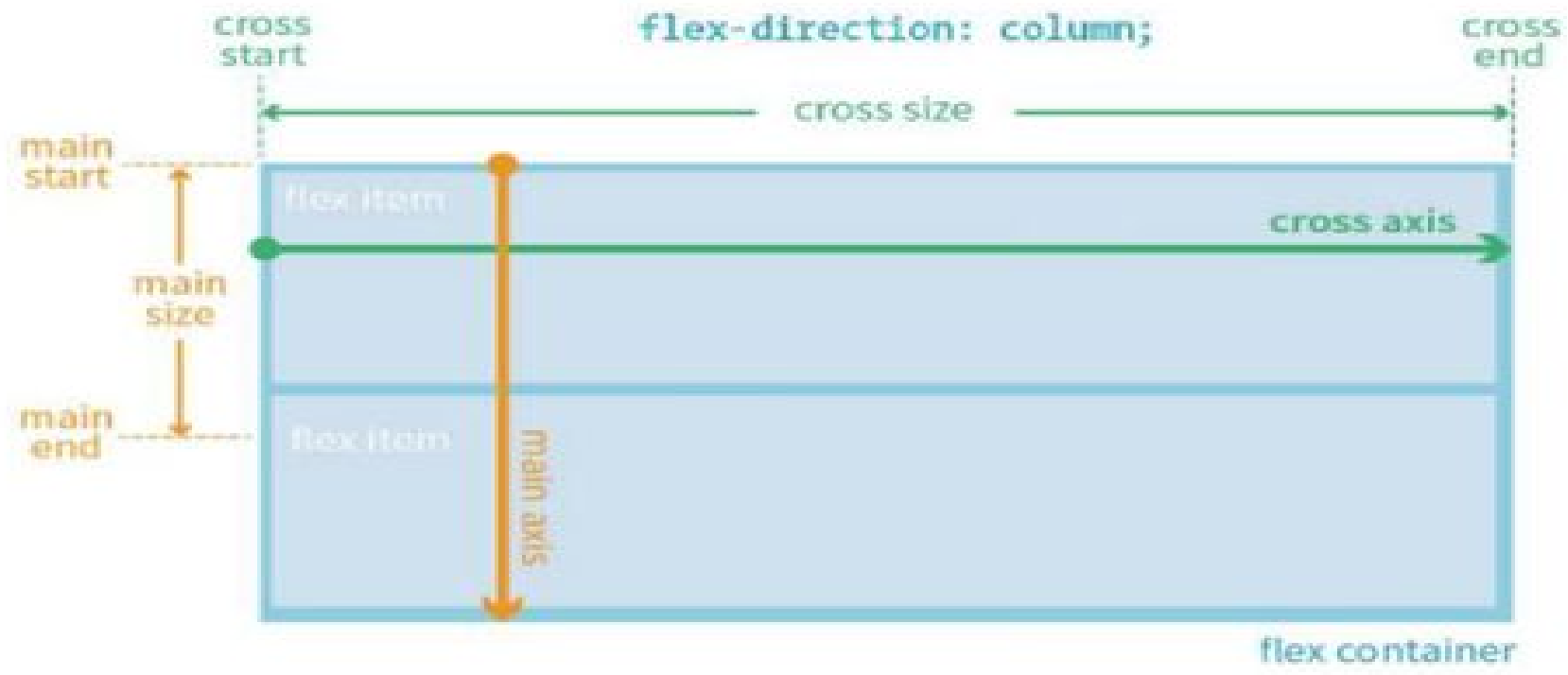
flex-direction
row | column | row-reverse | column-reverse
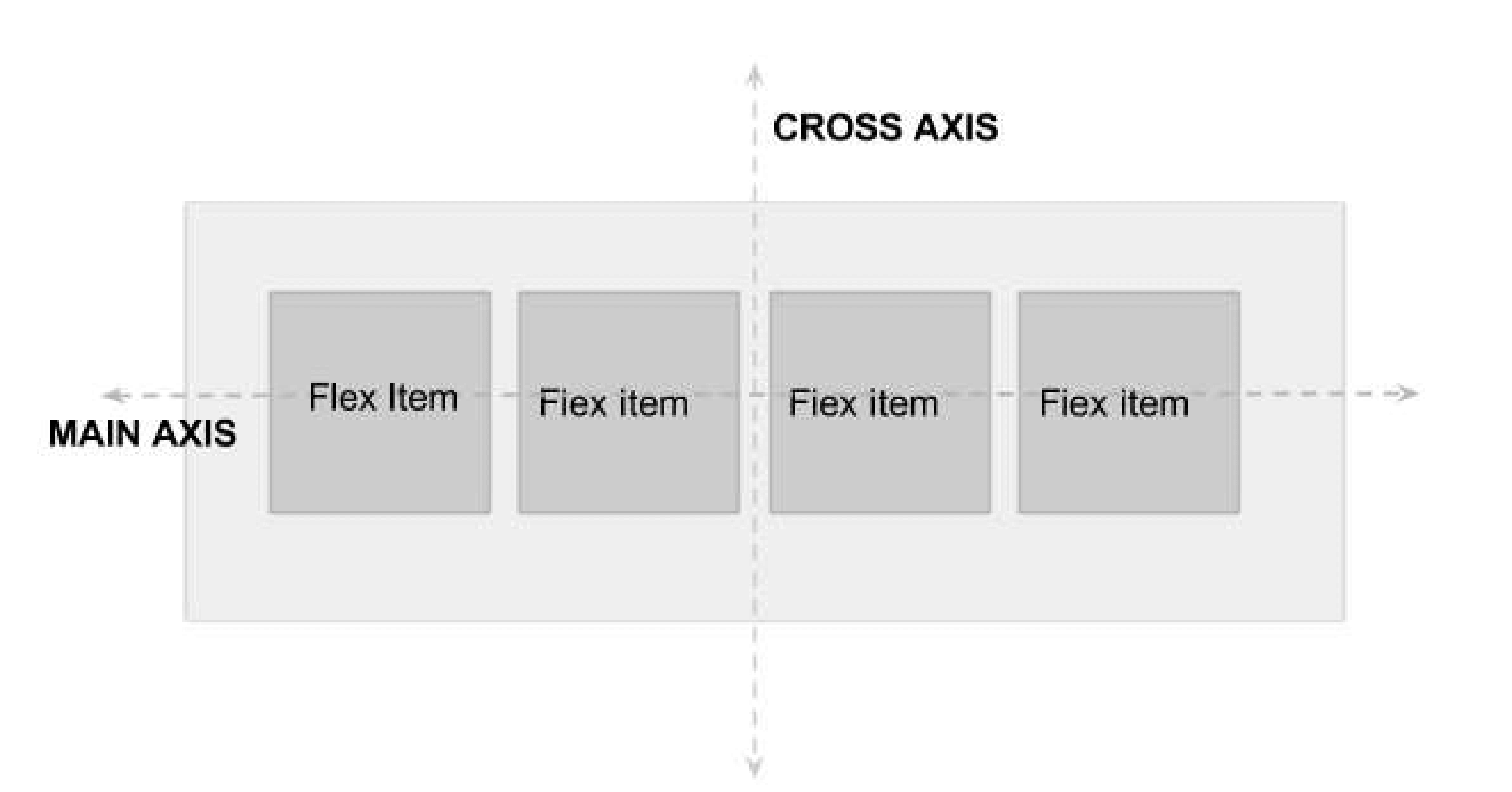
Flex items {}
FFlex items line up along one axis
Main axis -or- cross axis
The main axis is the flow direction you’ve specified for the flex container. The cross axis is perpendicular to the main axis
Note: axis direction is specified t the direction of the writing system in use.
For Example: write In horizonally oriented languages – ‘row’ would align items horizontally.
Vertically oriented languages – ‘column’ would align items vertically
When flex-direction is set to row, the main axis is horizontal and the cross axis is vertical
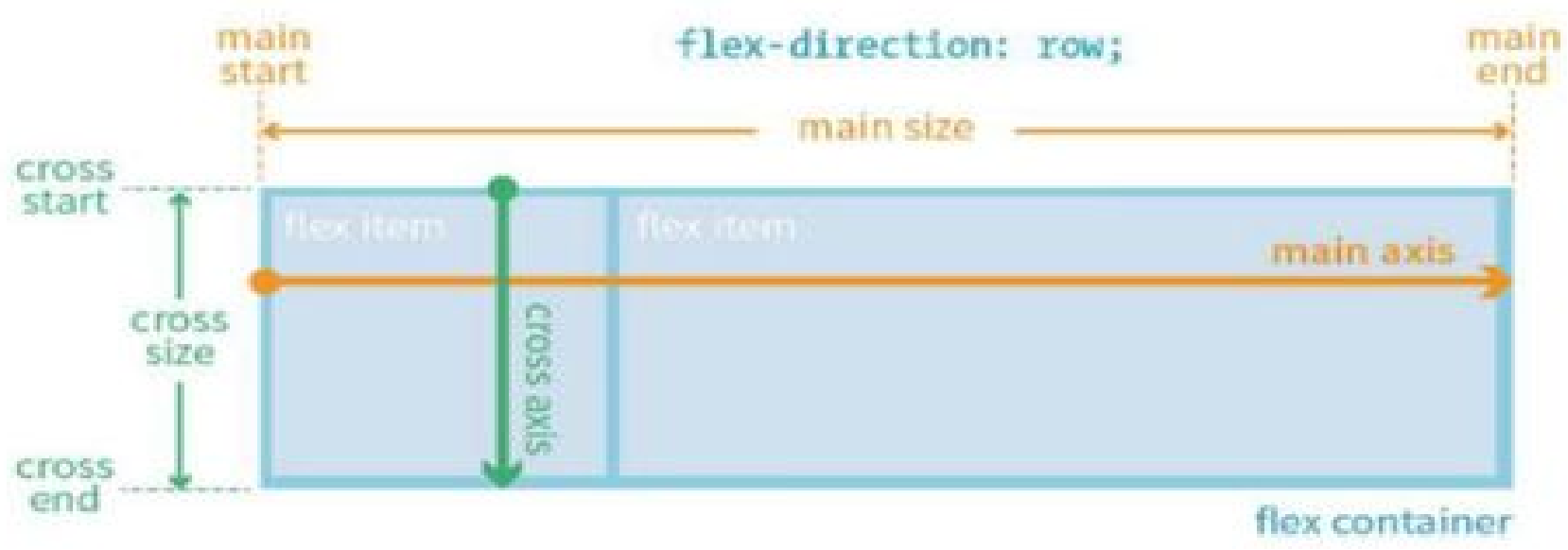
When flex-direction is set to column, the main axis is vertical and the cross axis is horizontal
flex-wrap (flex-direction: row;) { }
nowrap(default) | wrap | wrap-reverse.
When wrapping is disabled, flex items squish if there is not enough room, and if they can’t squish any further, may get cut off if there is not enough room in the viewport.
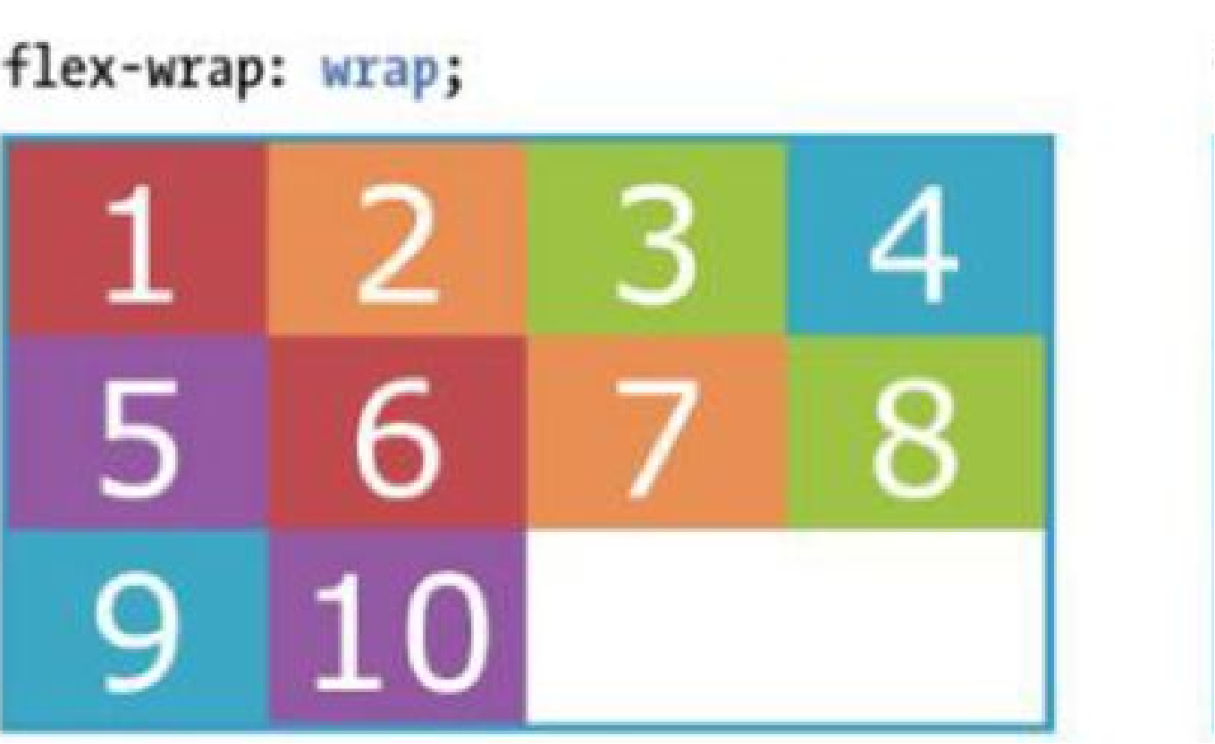
1 2 3 4 5 6 7 8 9 10 | <div id=”container”> <div class=”box box1”>1</div> ---------------------------------- <div class=”box box10”>10</div> </div> |
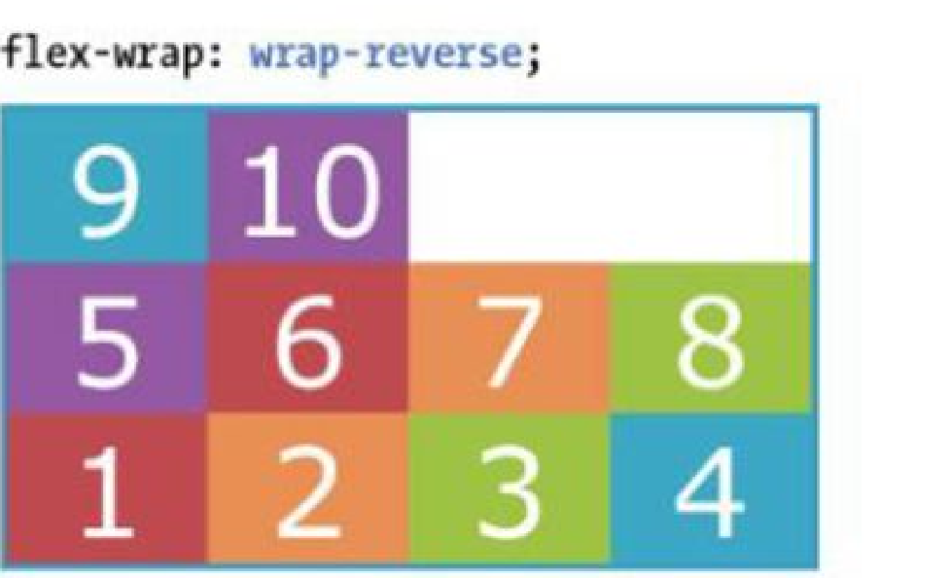
1 2 3 4 5 6 7 8 9 | #container { display: flex; flex-direction: row; flex-wrap: wrap; } |
1 2 3 4 5 6 | .box { width: 25%; } |
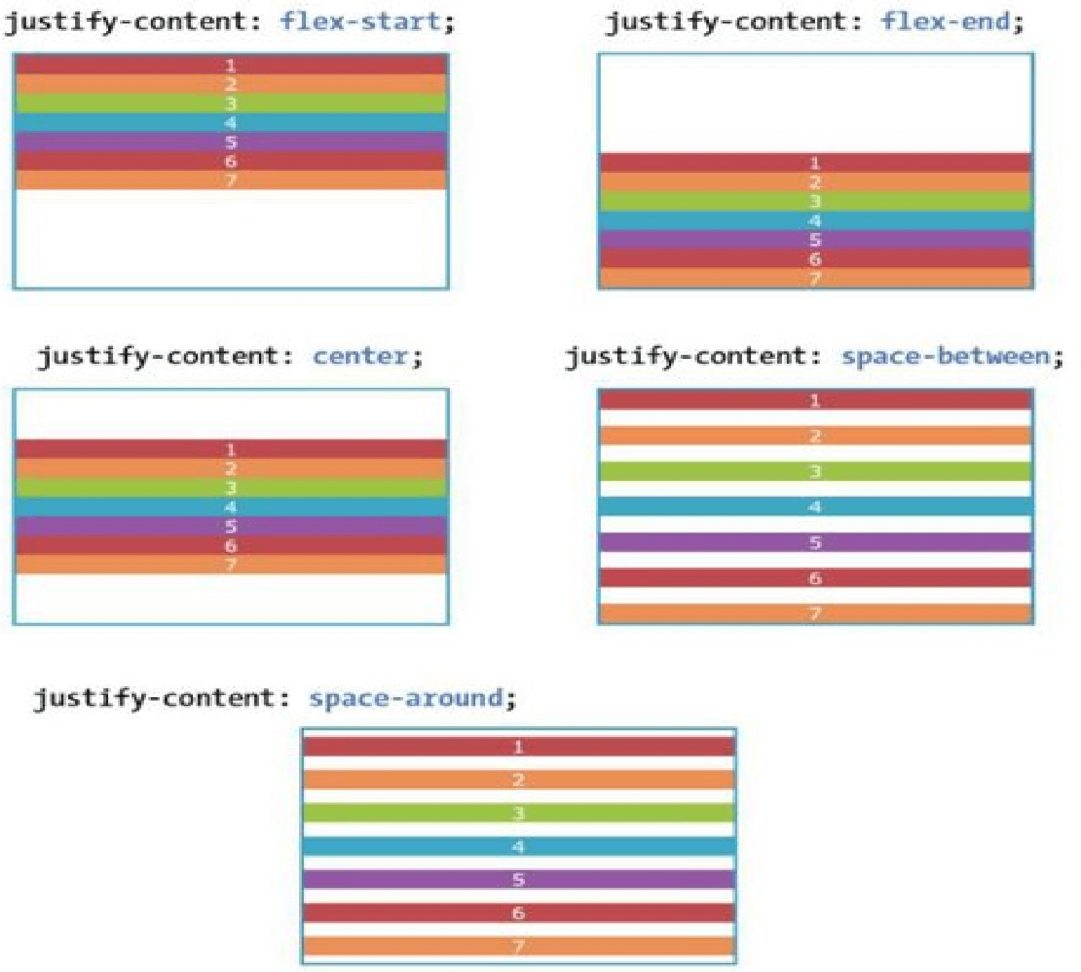
justify-content (flex-direction: row;) { }
flex-start | flex-end | center | space-between | space-around.
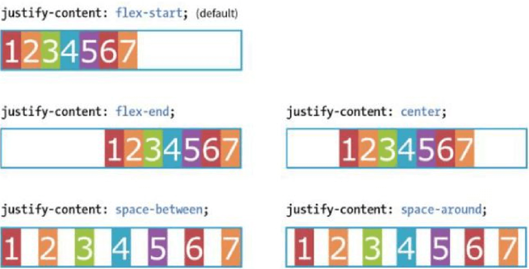
Flex items are, by default, as wide as they need to be to contain the element’s content.
The justify-content property defines how extra space is distributed around or between items.
justify-content (flex-direction: column;) { }
flex-start | flex-end | center | space-between | space-around.
Flex items are, by default, as wide as they need to be to contain the element’s content.
The justify-content property defines how extra space is distributed around or between items.
align-items { }
flex-start | flex-end | center | baseline | stretch
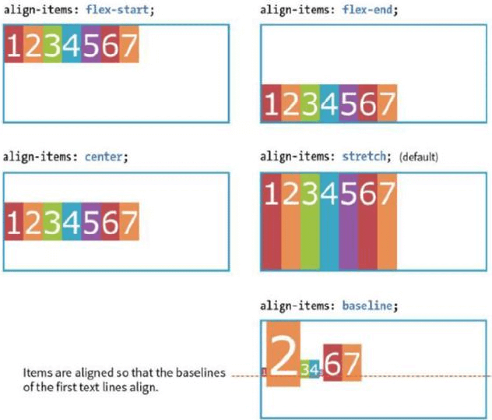
The align-items property allows you to arrange items on the cross axis (up and down when the direction is row, left and right if the direction is column).
Note: you must specify a container height
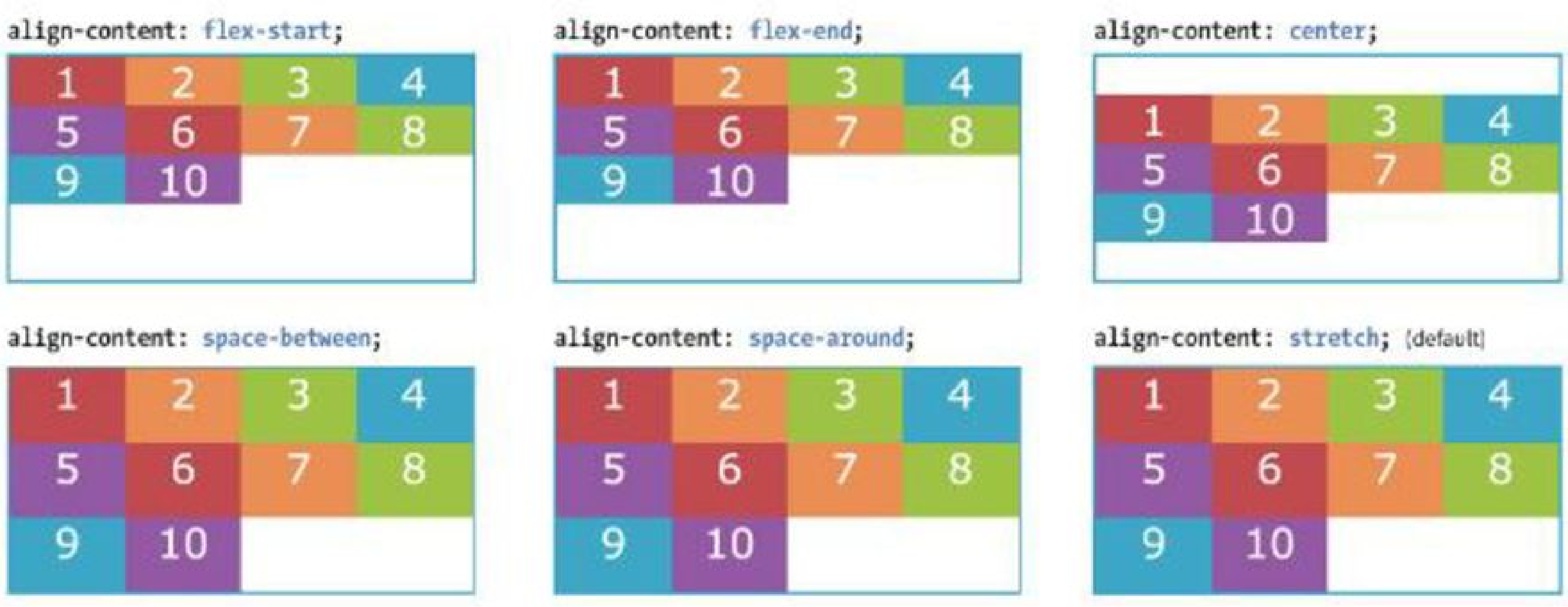
align-content { }
flex-start | flex-end | center | space-around | space-between | stretch
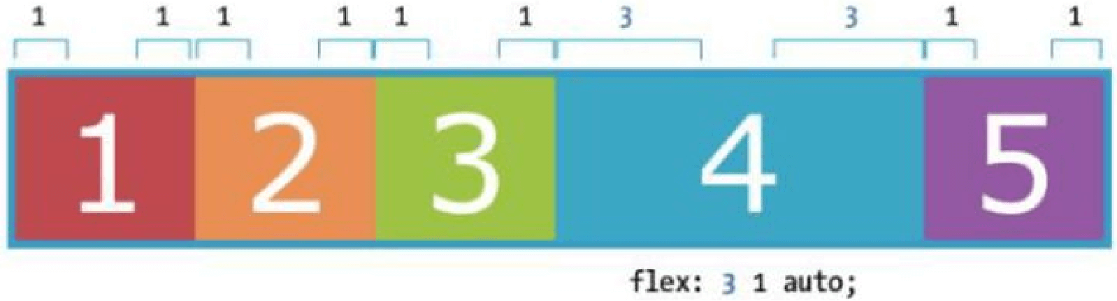
flex-grow { }
Value: number Default: 0
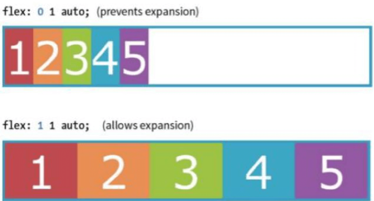
The Markup
1 2 3 4 5 6 7 8 9 | <div id="”container”"> <div class="”box" box1”="">1</div> <div class="”box" box2”="">2</div> <div class="”box" box3”="">3</div> <div class="”box" box4”="">4</div> <div class="”box" box5”="">5</div> </div> |
The Style
1 2 3 4 | .box{ flex: 1 1 auto; } |
A flex-grow value of “3” means the item receives three times the amount of space than the remaining items set to flex-grow:1
1 2 3 4 | .box4{ flex: 3 1 auto; } |
flex-shrink { }
Value: number Default: 1
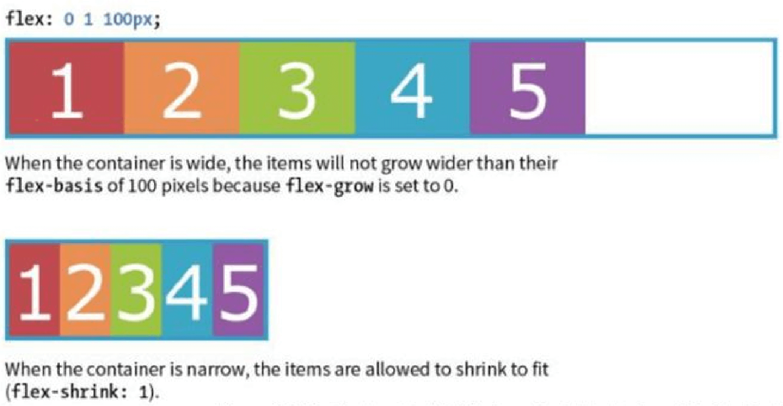
When flex-shrink is 0, items are not permitted to shrink and may hang out of their containing element
Flex items stop shrinking when they reach their minimum size (defined by min-width/min-height).
1 2 3 4 | .box { flex: 0 1 100px; } |
flex-basis { }
Value: length | percentage | content | auto
Flex-basis defines the starting size of an item before any wrapping, growing or shrinking occurs. It may be used instead of the width property (or height for columns) for flex items.
By default, flex-basis is set to auto (width/height value of item size)
If item’s size is not defined or set to auto – flex-basis uses the content width.
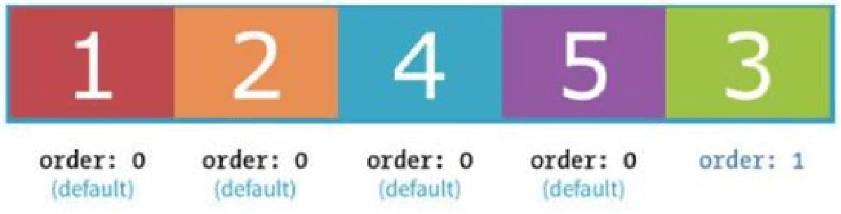
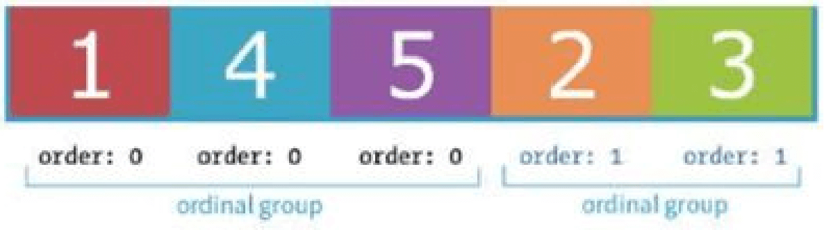
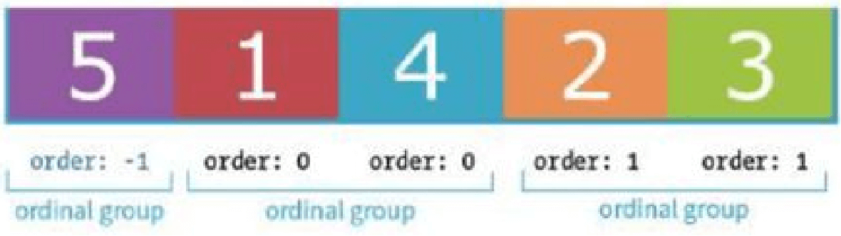
Flex order { }
Value: integer | Default order value is ‘0’
The order property give the ability to display items in an order that is different from the order in the HTML source code.
If items have the same order value = laid out in order they appear in code
If items have different order values = arranged from the lowest order value to highest.
1 2 3 4 | .box3{ order: 1; } |
1 2 3 4 | .box2, .box3{ order: 1; } |
1 2 3 4 | .box5{ order: -1; } |
Its all about Flexbox, Hope you liked it. I am attaching a PPT as well with demo & download link.